Data art, the art of how data can be interpreted through identity

I found some artists that I considered relevant and inspirational to my work and the concepts i am looking at.

Sterling Crispin

By utilising facial recognition and algorithms designed to pic out specific codes that make up the data a machine uses to recognise ones face. that compilation of data is exposed and turned back on the machine to essentially highlight whats really being seen. These meta faces these illusive characters are formed and create a rather amorphous mask structure that can be essentially viewed as mutations.

though i’m not looking at the idea masks as an art form, they are very unique and so intrinsically linked to the digital age, who we are and what is happening. this art is definitely in the same range as my own concepts.

http://www.sterlingcrispin.com/data-masks.html
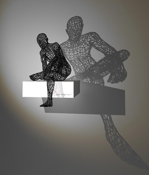
Digital Identities 

These sculptures express how an analogue snapshot of complex digital identities can be presented. Based on four de­fined cri­te­ria all sculp­tures are compa­ra­ble in their form, size and ex­pres­sion. generating those sculp­tures based upon the particles only, time is added as an under­lying factor. these complex generations of a persons interest, communication habits and behaviours are expressed through 3d printing and suclpture.

the sculptures created are a unique snapshot of ones online identity.

http://digital-identities.com/concept.html

Eyal Gever

I find this work so interesting,  simulations that are used to recreate conditions of real world disasters, natural or otherwise. Partical and physics simulations, are used to create the conditions of how the forms will change. its so interesting to view and explore his art and understand how these shapes in there most basic forms suffer under the weight of these conditions.

http://www.eyalgever.com/Installations

Looking at how digital matter changes forms is very similiar to how my own work decimates the faces and abstracts them from there original forms. this art is the next level, coding physics simulations, digital identity measurement. this is something that my work could evolve into.

Getting everything glazed and fired

So after returning in easter, I had all my work made, and bisque fired, nothing cracked or got damaged. so that was very relieving, i didn’t put any air holes in my work which was something i forgot to do, but because everything dried slow and well in my room before it seemed to do no harm. IMG_3565

All happy, now to sand them all down, this was for sure going to be tedious but had to be done.

I had to play with various grit sand papers to get the smoothness right, and to make sure i got rid of any bumps.

Once all done, time for glazing, I glazed everything with transparent that fires at 1060, nice and simple, easy to make and apply.

I couldn’t fit everything in the kiln so i had to book a second top loader.

When they finished firing I got them from the kiln and I had a problem! they hadn’t fired properly, none of them. some of them didn’t even have glaze on them. I had no idea how, i thought i sprayed them well, apparently not.

You can see the shiny top and the completely bare bottom of the chin

You can see the shiny top and the completely bare bottom of the chin

So i had to mix a new glaze with some gum arabic to adhere it to the glossy areas of the heads, so i resprayed them all ALOT.

and re-fired them all with a 25 min soak for good measure.

Now came another problem, the second head of myself was too big.. somehow, it didn’t shrink the same as the first one i made.IMG_3606

here is the poor fit. luckily i had a solution. I did make another one but cast it aside because it had defects. I sort of in my desperation and hurry patched a hole in it with a piece of random clay i found, before it was bisqued. this left an odd mark on it, so i thought what if i sprayed and glazed it white?

IMG_3685The white is noticeable, but acceptable at this stage. all are now glazed perfectly! what a relief.

Making and Sizing the faceplates for the head

Now that I have my first head cast, i can finally size up the faceplate 3d models to get the scale right.11146071_10206389622240983_29746953_n

With these base dimensions in mind i can work the model, of the faceplates. i still printed a few variations to find the best size.

IMG_3455

All were about a millimetre apart in size.

These are how the various sizes fit on top, some completely didn’t work, I varied the thickness of some, I did have a winner though.IMG_3460

The way these colours contrast works so well.

so now i have the correct size, time to make more with the various decimations.

Heres the files being sized and made, making sure they fit well to the model first then working to the ceramic in maker ware to correct the size.

IMG_3468

I went and printed the other faces, and all look very nice, there is an issue with the higher decimation pieces.

Screen Shot 2015-05-09 at 21.11.41 They are so warped because of the lack of triangles they don’t fit great, I have a solution to try and fix this.

I re-meshed the backs by selecting just the backs so they have a different mesh to the fronts.

Screen Shot 2015-04-02 at 02.16.51

I re printed them in wood filament. and hoped they were abit better.

You can see in the video the different fronts and the new backs, fingers crossed this works.

now that i have all 4 i can silicon mould them.

I rushed these, i wish i thought them through better, i should have thought, how am i going to pour, how will the wax fill every section, this wasn’t well prepared.

Making all these Shape Heads

Right, Time to make a load of heads. I have all my plaster casted shapes, I have created a pretty cool, modular plaster cast on the fly, which i am very proud to have adapted.

Now is the time to talk what i want to expect from these casts, I want them to look as ambiguous and as anonymous as possible, no discernible race, gender no defining characteristics, like my original drawings. If i had thought of and started this idea sooner, the 3D model would have been redone from scratch, sadly time would not permit.

11251708_10206590160374311_1977982516_n

My first few casts, lots of fettling to do.

So I will just have to work into the clay head by hand.

My first attempt to work into the clay cast , I thought I could almost ‘shave the hair off.. nope! not happening, i thoroughly messed up this head.

So i am going to have to find a compromise here.

11216328_10206590155414187_1039718277_n

I had made one cast and thought it was a little off, it felt to top heavy, so i cut it down the middle to understand the thickness and timing, this was about 20 mins, and i changed it to 25 mins after this, this particular cast, is actually pretty even and not bad (bit late to realise that though).

These casts produced lots of fettle marks, and required alot of work,I worked into them all with a sharp blade and various wood tools. i removed a fairly sufficient amount of clay, and i had to fill the hole the pony tail created when cut off and the hole the pour spout left too.

11084403_10206590152654118_319869102_n

After smoothing with an abrasive sponge, i didn’t get to deep on the smoothing because i intended to sand the bisque fired work. i waited for the pieces to dry and used a sharp blade to refine the inner shapes.

11216152_10206590153174131_365090339_n

going very well so far.

11255136_10206590155494189_102856593_n

I started to churn out heads at a good pace. It would take about 25 mins of time till i could pour the slip out the cast, adding a few mins each time due to saturation of the plaster mould. Then 2 hours of waiting for the cast to dry up, and then about an hour or 2 to work into the heads fettling and cleaning them.

Glazing The first head

The glazing is so important because It will determine the final size of the heads, once fired which will be at 1060 due to using just basic transparent glaze. its shrinkage will be finalised and i can at last measure the heads inner circle to calculate the final size of the faceplates.

Using he spray booth I sprayed the heads with 3 coats all the way round, I could only fire one as the test kiln was only bog enough for one, but thats all i need to get the dimensions down.

11145954_10206389513398262_1598611173_n

examining the fired piece i noticed one or two tiny cracks, they shouldn’t be to big of an issue though.

11132089_10206389513438263_1341965496_n

As i spun the wheel on the spray booth I evenly coated the piece.

11115979_10206389513478264_713274609_n

I glazed both pieces even though one of them was a rather poor quality one, due to cracks.

11139758_10206389513598267_460535353_n

Heres the immediate results. certainly cant complain about that!

designing my exhibition space

I have created some renders for my exhibition space. I wanted to keep everything fairly uniform, nothing fancy, just simple and orderly to make things clear to interpret and display. I wanted some inspiration to come from the metro look design language, for no simpler reason other than i rather enjoy it. this style works as a way to just make everything fit in service of each other, just like the basic premise of my ideas, with the faceplates.

There will also be renders of my work in print on the space as well, to help provide context and design coherence to my ideas. I need to include 4 plyths for the main heads i have created, and the 8 smaller heads with shapes on them. as well as a way to display the faceplates which will either be 15 or 24 in number depending on time. so a board will need to be designed for that. also consideration to my artist statement location as well as where and how business cards can be displayed.

i drew a couple thumbnails for ideas.

IMG_20150410_0002 IMG_20150410_0001

I thought about curving the space, felt like a bit of an undertaking. and i also started to think about how to display the faceplates. adding walls left and right provided this claustrophobic feel that doesn’t encapsulate the feeling i want when viewing my work.

I really wanted to keep the spirit of the metro feel, i find it to be just clean and it works. I drew something in autodesk sketchbook in basic block shapes with the metro style to help capture the feel.exhibition metro sketch

Screen Shot 2015-03-30 at 09.30.02

first idea i put shelves either side of the screen of faceplates, i didn’t like this as it broke up the work. and separated there elements. also the rendered image squares felt a bit small and dull.

exhibition render34343

exhibition rende66r

I like this design, Its simple and it ultimately works for giving everything its own space but also showing what is to be viewed together and also what is viewed individually.

exhibition render6

adding every STL file into a single space really made the render difficult to process.

exhibition render56

exhibition render11

These material renders in this monochrome style are probably going to make it into my final exhibition space.

exhibition render88

exhibition render222

exhibition render8877

Digital artists and art

Kyuin-Shim

I thought this digital piece by Kyuin-Shim was really relatable to that idea of digital connectivity i’m looking at, that idea of connection and sharing is so literal within this abstract facade. i would like to see this sculpture become a fountain in real life.

Adam Martinakis

How beautiful is this! Adam Martinakis always produces such wonderful exciting digital art, there is an idea of material contrast in his art, in the piece above its like a visceral concept of taste. I love it. I want to see these formed in real material and sculpture.

http://adamakis.blogspot.co.uk/2015/05/the-taste-of-material.html

This art is so good, they are great digital pieces that don’t really need to transcend there current medium but i think the reason i find them so appealing it because they aspire in essence to be physical and real.

Researching some exhibition spaces

I had a look to see what i could find for inspiration for an exhibition space. In thinking about the general style I am quite drawn to the metro design language used by microsoft, i would like to just subtlety emulate that maybe just through the basic layout of everything or even down to how i position the rendered photos of my work.

The metro design language.

http://en.wikipedia.org/wiki/Metro_%28design_language%29

i also found some examples of spaces which interested me.

this space is nice and simple i like the size of the statment on the wall next to the work. i could probably achieve this with a vinyl cutting machine for each letter. time consuming but it would look good.

This actually wouldn’t work very well for my work, because i think being at eye level is important for the head shapes at least. though that feeling over towing over ones work can create a level of insecurity in side the work perhaps.

very de stijl inspired. i like how everything works in relation to each other, but from a distance it holds up visually and has an inviting nature.

I think displaying the statement on the floor is super clever, or maybe even as a projection. except if it were a vinyl sticker, its likely to get walked on, and space is also important, if it were right in front of my work it would hinder people getting close to it, as they would be trying to read the statement.

I like the way Moto Waganari displays his work and his use of light. I could utilise this as there will be wireframes in my show. I also like the idea of putting your signature on the actual space which I may just completely steal!